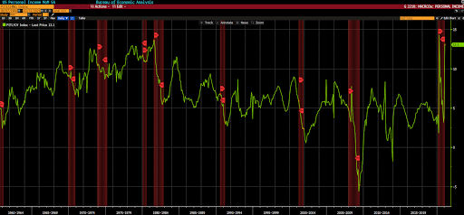
In this week’s main message we pointed to things that just don’t make sense during recessions, and that have occurred this go-round nonetheless.
One of those things was rising personal income.
Here’s that section:
Personal Income:
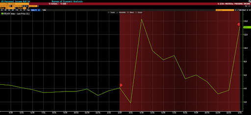
Let’s zero in on that last one:
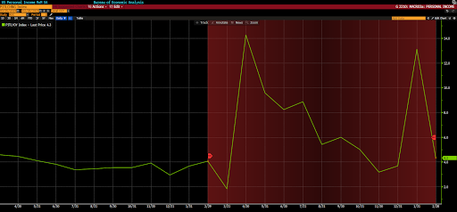
Note the huge spike in personal income March to April, when stimulus checks and extra unemployment benefits first hit. Then the dramatic trailing off. Then the huge spike when the December stimulus checks showed up. When this graph updates no doubt we’ll see a similar decline, then a big boost on the recent $1,400 per person round.
Should we suppose that the anomalies illustrated in these charts have virtually everything to do with the unprecedented largesse hurled into the spending — and the speculating — side of the economic ledger?
Then of course there’s the question you just asked yourself: What happens on the news that this form of stimulus simply can’t last forever?
Well, I suspect that it will correspond with the passing of a $3 trillion dollar infrastructure plan — which may indeed delay the inevitable demise of the most bubbly areas of the equity market. Operative word being “inevitable.”
Well, the graph updated (through February) this morning, and like I said:
“Nobody can be personally held responsible for these problems, although we love finding scapegoats in the political and economic fields. These issues are simply coded in the function of the system.”
Have a great day!
Marty


