
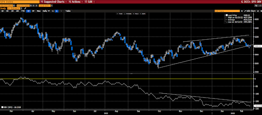
In last Friday’s video commentary I suggested that the then selloff lacked some potential to break key technical support based on an utter lack of volume.
Well, if a lack of volume diminished the probability that last week’s selloff contained sustainable downside oomf, the same so far today must therefore (for the moment) diminish the probability that today’s rally contains sustainable upside oomf… Although there’s a compelling case to be made for a notable technical bounce given critical support levels maintained last week.
The dotted line represents today’s trajectory of SP500 total volume, the solid lines represent 5, 10 and 20 day average volume:
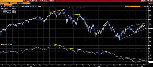
Now, the task is to see if there’s a trend… One way to do that is to consider “on-balance volume.” Which draws a line that accumulates volume based on total shares traded on up and down days… I.e., the line moves to the extent of total volume in the direction of the index’s close vs the open: When the SP500 is down, the line moves downward to reflect all of the day’s volume, and vice versa…
Note that while all indicators are imperfect, this one, over shorter periods in particular, is expressly so; in that should, say, the market go from green to red by a mere point during that last 5 minutes of the trading day, all of the volume that day will be credited to the downside, even though the market may have traded up virtually all day… Over extended periods of time, however, our assessment shows that it indeed has some predictive value.
Note the rising trend in SP500 price (top panel) off of the October low, versus the declining trend in on balance volume (bottom panel)… This would denote greater conviction on the down days vs the up days:
Consider the past couple of years: