
In the portfolio management world the term “short volatility” means essentially positioning in a manner that benefits from a low-volatility/rising asset price environment.
A portfolio that is “short volatility” typically enjoys extended periods of nice, incrementally (barring the occasional hiccup) positive returns, with periodic bouts of large surprise shocks that tend to wipe out literally years of those nice, incremental gains… A simple buy and hold stock portfolio would, technically-speaking, be your classic example…
A “long volatility” hedging strategy, in contrast, is one where small ongoing costs are incurred, with periodic bouts of large surprise shocks, when outsized gains on the hedge are realized. I.e., it’s akin to paying insurance premiums in order to mitigate huge losses during those surprise shocks.
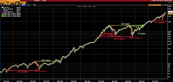
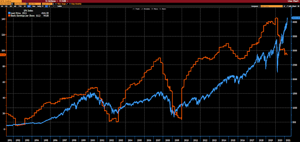
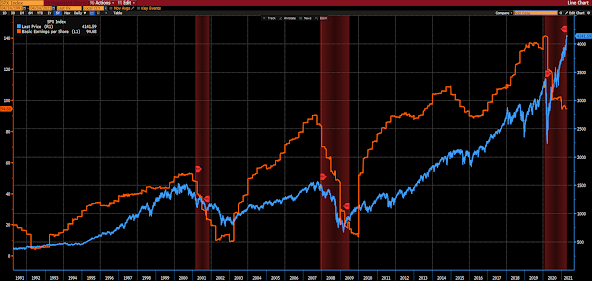
Our busy graph below (translation to follow) plots the past 60 years of action in the S&P 500 Index. The red arrows illustrate the number of years’ worth of gains the 4 major bear markets of the era ultimately took back. The green arrows (in the 73/74 and the ’00-’03/’07-’09 episodes) denote how many years it took to sustainably recapture the pre-bear market all time high.
Note: The recovery from last year’s selloff was too quick to allow me to squeeze in a green arrow, and of course it may yet be premature to label the recapture “sustainable.”
“It’s just very hard to find historical examples of a cycle that looks like this one. We can obviously go back to the previous big pandemics and think about how they played out, but the policy responses were totally different.”“…certainly on the stimulus front in the U.S.. We’re just talking about totally unprecedented numbers. Even the numbers we’ve already achieved are unprecedented, at least all the way back to the second world war. And we’re already talking about the next round. We’re just getting the last round signed and we’re already on to the next one.”
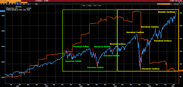
If you’re new to our firm, say, within the past 2 years, it would be entirely understanding for you to surmise that we are inherently risk-averse. If, on the other hand, like most of you (clients), you’ve been with us throughout a market cycle or two, you know that there’s nothing inherent about our presently cautious approach to U.S equities.
In fact, during what was, at the time, the most volatile year of the longest bull market in history, 2018, we maintained our bullish posture throughout. It wasn’t until late-summer 2019 that our assessment changed — due to general conditions at the time — and we became “cautious” with the regard to the risk/reward setup for the U.S. equity market.
Here’s a 5-year graph of the S&P 500; the green box captures January 1, 2018 to August 2019, the yellow box captures everything since:
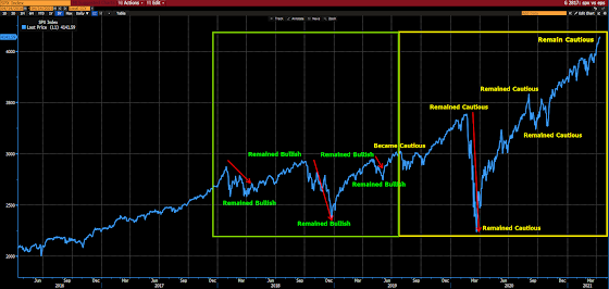
Note my notations — pointing out our bent throughout the two periods.
To get a feel for why we remained sanguine (maintaining the bullish posture we adopted back in early 2009) during the depths of the near-20% selloff in Q4 of 2018, here are a few snippets from our weekly message on 12/21 of that year:
“We are forever in search of the signs and signals that say “warning! Recession ahead!” As, typically, bear markets are things of recessions.
So how do we do that? We do that by testing the data that matter against the periods that led up to past recessions. And as we perform that function here today, the character of the data on balance (per our proprietary macro index) does not yet signal recession, and remains notably more positive than it was during the whopping 2011 correction, and slightly better than the 12+% draw down of early 2016, yet somewhat worse than conditions during the 2015 correction.”“Here’s a small sampling of the data we track (shaded areas are recessions, I circled the areas around the 2011 correction and the back-to-back corrections of 2015 and 2016). I of course cherry-picked examples that emphasize my point, and those that most folks are familiar with and/or can relate to:”
“As you no doubt noted in the above, as it relates to the featured charts, present conditions do not remotely resemble recessions past, or even the 2011 and 2016 market corrections.”“History suggests that this — a correction amid an ongoing economic expansion — is the stuff strong rallies are made of.”
Now let’s fast forward to our September 1, 2019 blog post to get a feel for the state of general conditions a mere 9 months later:
“As we’ve been discussing and illustrating herein, we see real under-the-surface cracks forming in the macro economic setup. All the while there’s this popular (in some circles) narrative that those of us expressing such concerns run the risk of talking the economy into recession.
Hmm… well, sure, sentiment is huge when it comes to the economy, but I can think nothing more dangerous/irresponsible for an investor or money manager to do than to pretend everything’s perfectly okay, when clearly it isn’t. We must see things as they are, and act accordingly.
Speaking of “seeing things as they are”, here’s our charting of some of the data points that currently weigh on the Economic and Financial Stress subindexes within our proprietary macro index — which just came in below zero (heightened recession risk) for the 5th consecutive week:”
Okay, so skimming through past commentaries it occurs to me that I could do this all day, so I won’t. Suffice to say that the evidence was sufficient to demand that — after remaining unwaveringly bullish for the 10 previous years — we begin hedging portfolios as of late-August 2019… Then, by December of that year, and incrementally since, we’ve been managing, via sector and asset class shifts, to a position mix that has us less correlated to the U.S. equity market, while taking advantage of the money printing and interest rate suppression that the powers that be are aggressively resorting to in order to keep modern history’s most ominous debt bubble afloat for as long as humanly possible.
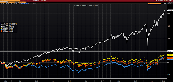
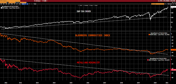
“…with regard to the opportunities in the commodities’ space, aside from the obvious, consider the relative performance setup that’s developed over the past 10 years.
I.e., while U.S. major equity averages are stretching epically into all time high territory, commodities and miners are just now breaking out of a decade-long downtrend:”