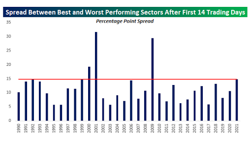
If you’re at all wondering what keeps me harping on nearly every day lately about the poor sector breadth I’m noticing, well, Bespoke Investment Group — having noticed it as well — put some history to it this morning.
Apparently, over the past 30 years there have only been 3 that have seen a larger gap separating the best and the worst performing sectors as of the 15th trading day in (today):
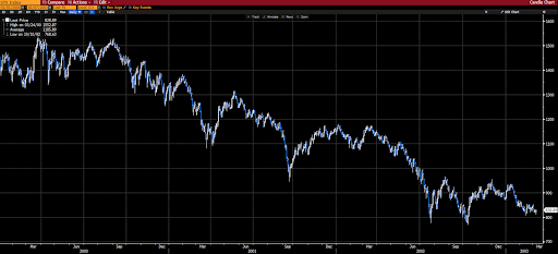
Per the chart, they were:
2000,
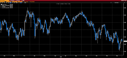
2001,
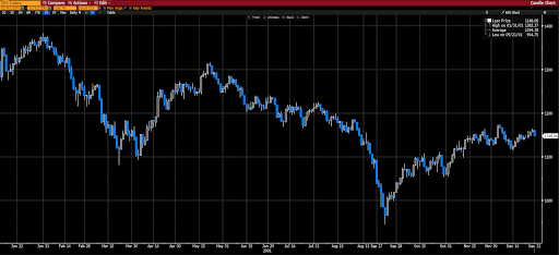
and 2009.
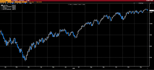
As you can see, 2 of the 3 turned out nasty. While the 1 that turned out nicely positive (coming off of the 07-09 57% decline), nevertheless saw a nasty selloff during the first quarter…
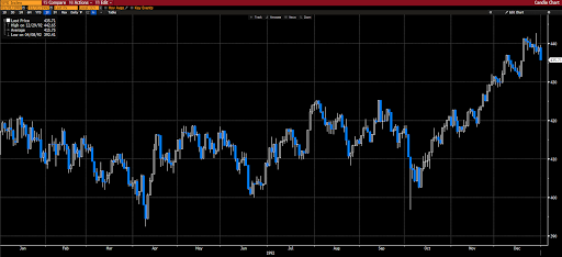
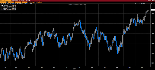
In terms of the 3 that came very close — 1992, 1999 and 2006 — all finished the year higher, but only after an immense amount of volatility during the first half+:
1992:
1999:
2006:
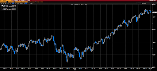
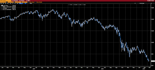
Of course we know what came in the years immediately after 1999 and 2006:
1/1/2000 to 3/9/2003:
1/1/2007 to 3/9/2009:
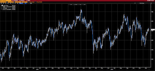
And, frankly, the 2 years following 1992 episode weren’t much to write home about either:
Stay tuned… and stay hedged!!


