
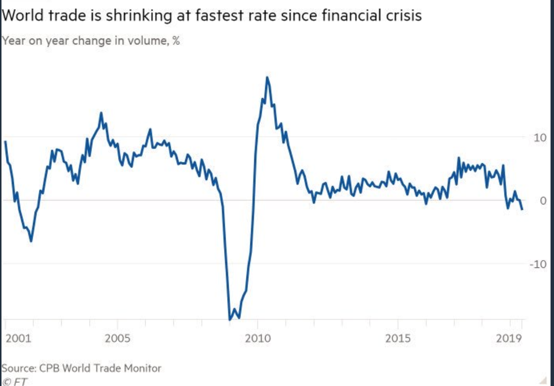
The first chart below speaks to what we’ve been preaching herein since our proprietary macro index peaked back in January 2018:
click each insert to enlarge…
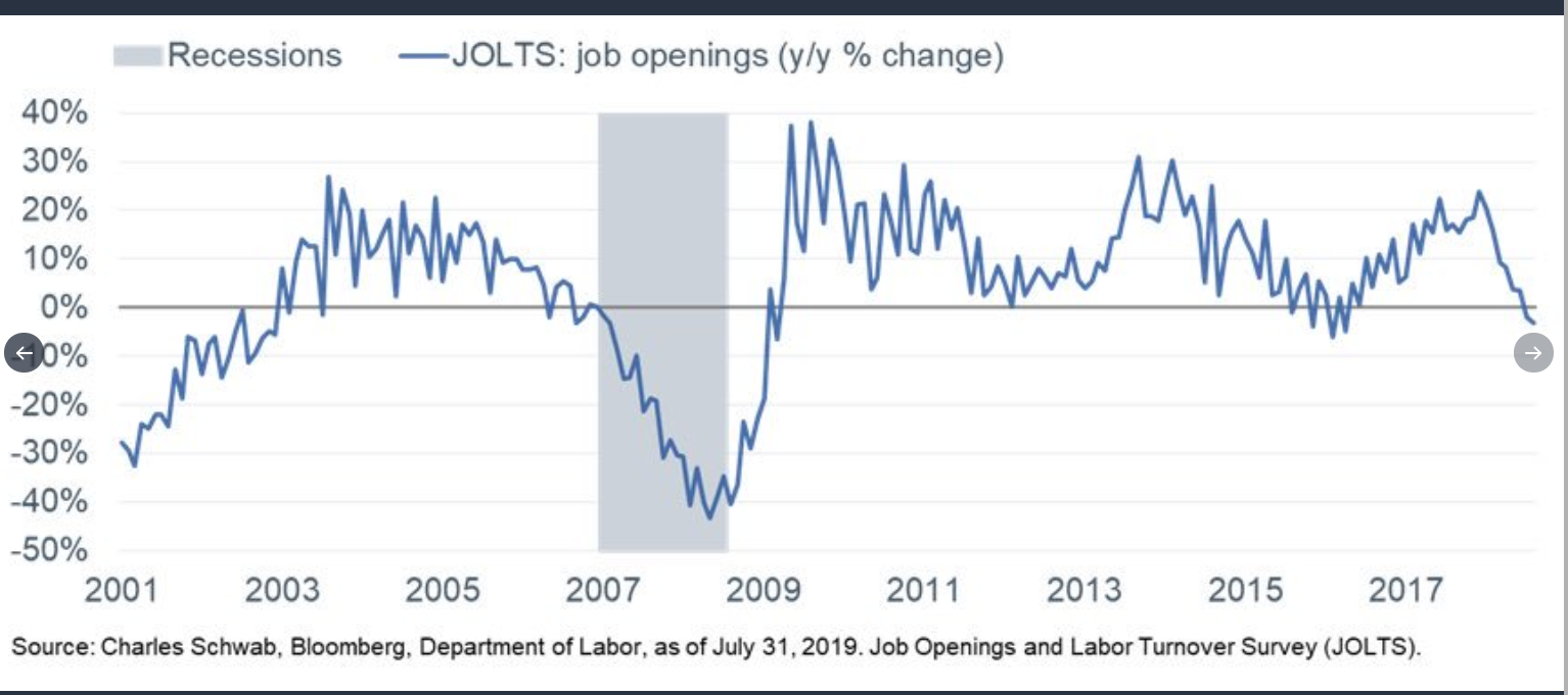
And here’s a bit of recent employment data:
Job openings:
Small business hiring plans (red), non-farm payrolls (blue):
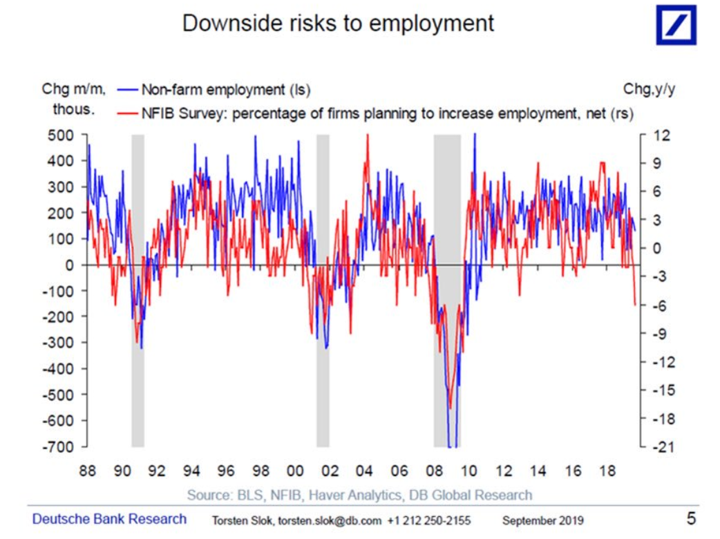
And, yes, the above, in our view, reflects both correlation and causation!