

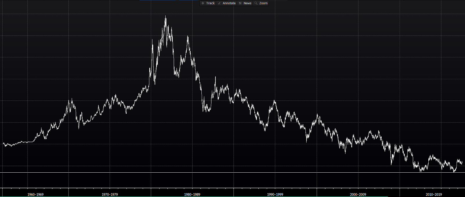
Here’s an unlabeled 64-year graph that I’d like you to take a look at:
click any insert to enlarge
A devoted market technician would tell you that he/she can predict the direction of a market-priced item, without even knowing what the item is, by examining the charts.
Technical indicators are only worthwhile if they’re robust; if they can be applied to all markets across the board. As we’ve discussed on multiple occasions herein, the 200-day moving average (dma) of the price of a given thing is probably the technician’s most respected long-term trend indicator.
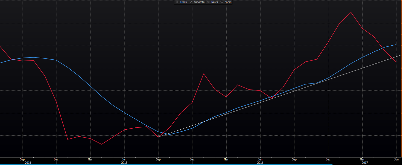
So here’s a 3-year look at the above item along with its 200-dma:
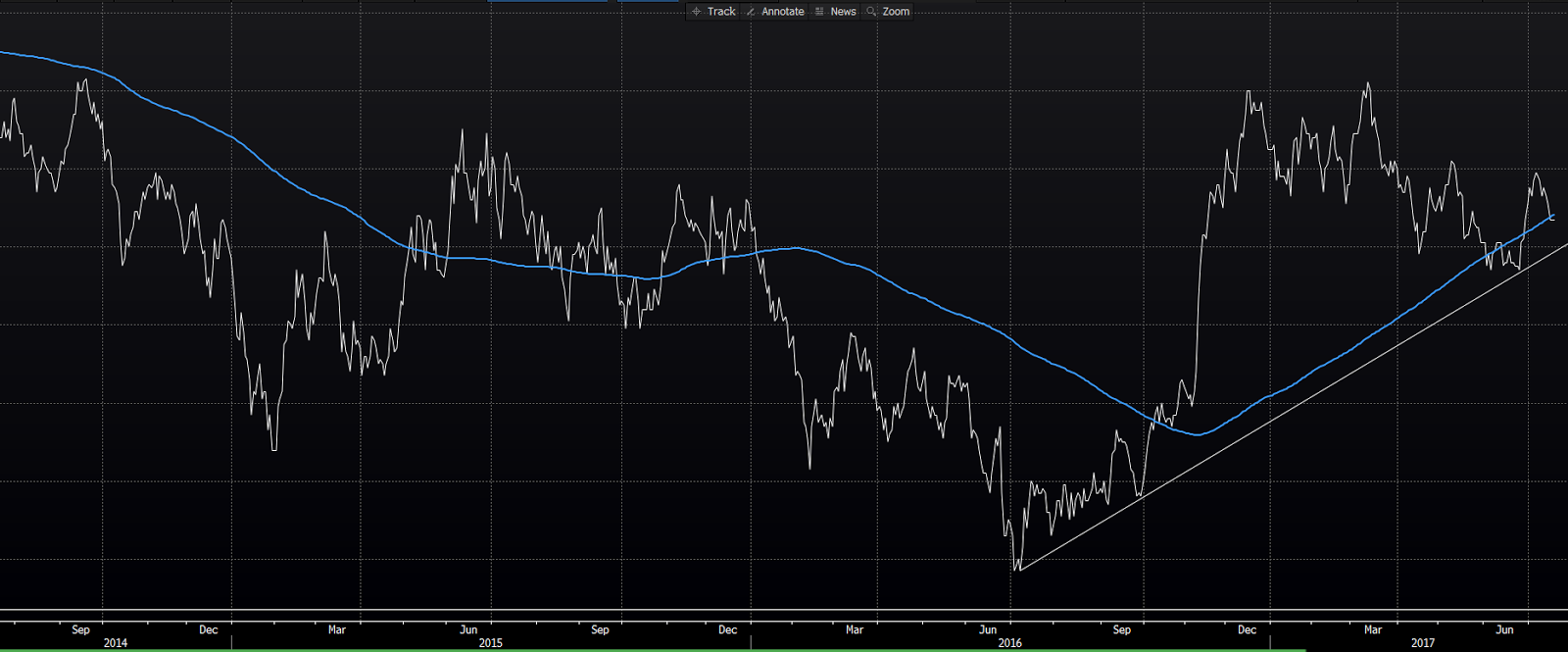
As you can see, I also included a trendline that connects two higher lows off of the July 2016 bottom.
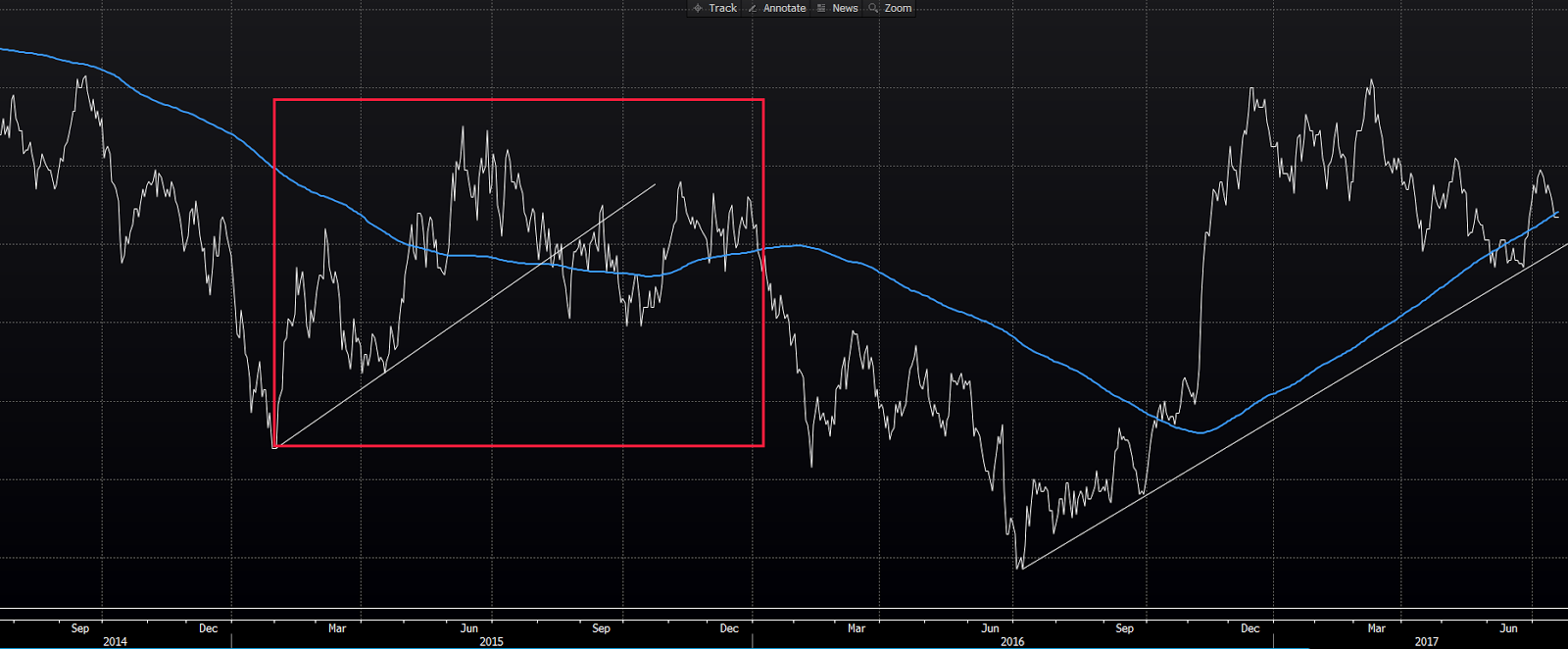
While I might argue that the graph immediately above is signaling higher levels to come, notice in the next graph how we might have concluded the same during 2015, only to see it plumbing new lows on into 2016:
Let’s jump to a different yet to be named item for a minute.
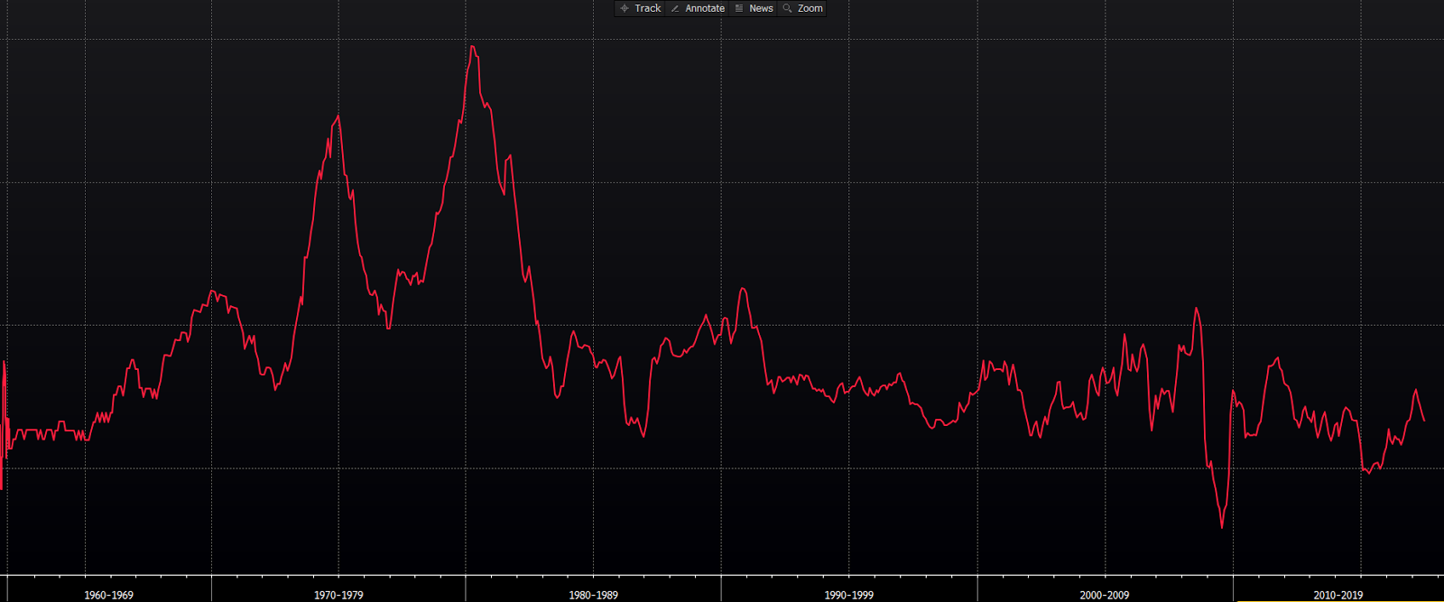
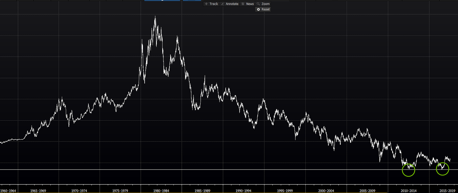
Here’s a 64 year look:
And here’s its 3-yr graph. Notice it wrestling with its 200-dma and an upward-sloping trendline:
Now, back to the long-term charts.
Here’s the first one again, note the recent test (and bounce off) of what may be an historic low:
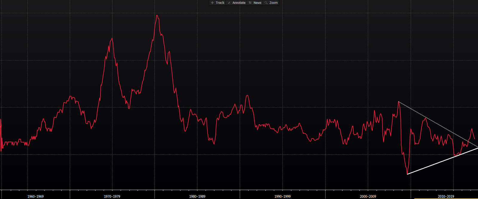
Here’s the second item again. Note the higher lows and the apparent break above what looks to be an 8-year triangle pattern:
So, if I we were to close here with an assessment of the prospects for the above two items — without considering what they are — I’d say that, despite recent head fakes (2015), probabilities point to ultimately higher moves for each over the coming months, perhaps years. Or, in other words — while absolutely anything can happen — the risk for both is tilted to the upside.
As it turns out, the public narratives of late for these particular items — the first being the yield on the U.S. 10-yr treasury note, the second being inflation, via the Consumer Price Index — conflict with the present longer-term signals of our charts.
So what are we to do with that? I mean, the folks at the Fed have clearly softened their tone on interest rate hikes going forward, and fed funds futures traders have adjusted their bets accordingly.
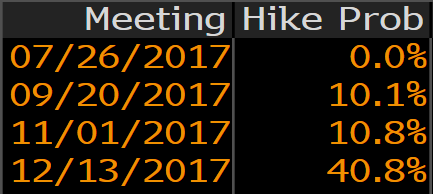
Here’s a look at what was priced-in (to the futures market) for 2017 rate hikes exactly two months ago:
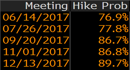
And here’s the look this morning:
So, again, what are we to do? Well, while I’d love nothing more than for interest rates to stay remarkably low — allowing folks to continue to access money on the cheap for their new homes and cars, and to make stock market investing easy peasy ad infinitum, while averting a painful blindsiding of all of those older folks who’ve abandoned their bank CDs for higher yielding bonds, etc. — the charts are telling us to stay clear of the punchbowl. The punchbowl being filled with the stuff (bonds [in general], utility stocks and the like) that possess a high degree of interest rate risk.
Bottom line: While indeed rates may, as many predict, stay lower for longer, in our view, the present risk/return profile of highly interest rate sensitive securities warrants caution.
Have a nice weekend!
Marty