

So, I virtually never read articles anymore with sensational titles (actually, I seldom read any ‘articles’ anymore). However, I can’t help but read a headline when it somehow sneaks onto my screen.
This title caught my attention this morning:
Economist Stephanie Pomboy says stocks are in a bubble so buy gold and bonds —
Well, shoot, she’s an economist so she has to be right! Just kidding. On this one I’m with economist (ironically) John Kenneth Galbraith:
The only function of economic forecasting is to make astrology look respectable.
And Rupert Murdoch (yep, in this one respect these two polar opposites agreed).
I’m not an economist, and we all know economists were created to make weather forecasters look good.
No disrespect to Ms. Pomboy, as I’m not familiar with her, but such an aggressive statement deserves a look at the data. I won’t speculate today on a potential bubble in stocks (other than to say that bubble suggests crazy-high valuations and crazy-high optimism, neither of which I’d deem crazy-high at this juncture), but I’m thinking we should consider the current setup for gold.
Before I go on I must emphasize that the following is not my prediction on where gold goes from here. This, rather, is me noodling a bit on inner-market relationships and why the stuff I’m seeing doesn’t quite fit a narrative that would have us rushing out to buy the yellow stuff right about now.
For starters, here’s a look at the one-year correlation coefficient (CC) for gold and the Fed funds rate:
click any chart to enlarge…
![]()
The CC measures the degree in direction to which two variables relate to one another. A CC of 1.00 means when one goes up or down, the other goes up or down to the same degree. A CC of -1.00 means with one goes up the other goes down to the same degree, and vice versa. As you can see, the CC for gold and the Fed funds rate is very close to the latter.
Now take a look at what Fed funds futures trading says about the probabilities of the Fed raising or cutting its rate at coming meetings:
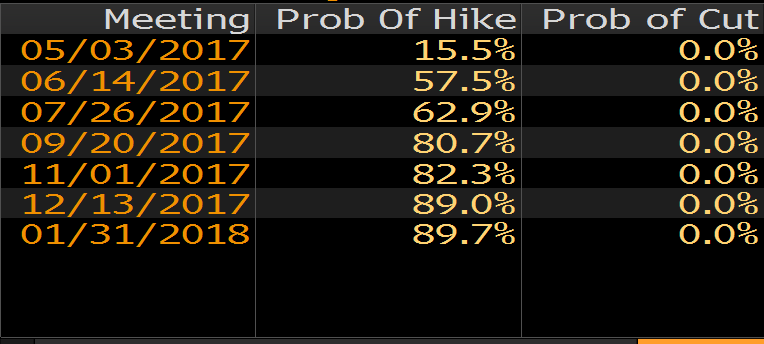
Well, the gold/Fed funds CC — along with Fed funds futures — would not have us storming the coin shop come Monday morning.
Aside from being very sensitive these days to the Fed, Gold is of course the quintessential fear play. Meaning, when the world fears its existence is in question, it piles into gold.
Now, make no mistake, you’d be hard-pressed to find any folks more skittish than those who’d oblige themselves to take on someone else’s debt: They would be the investors who play the Credit Default Swaps (CDS) market. Here’s my CDS description from a recent post where I used the concept to make a similar point:
There’s a thing called a Credit Default Swap (CDS); it’s in essence a guarantee of someone else’s, or an entity’s, debt. For example, if I buy a French government bond and want to protect myself, I pay a guarantor a slice of the interest to protect my investment, should I be stiffed by the French. The contract we enter into is the CDS. Of course the riskier the borrower the more the interest the guarantor will require of me to protect myself. Make no mistake, the issuers of CDS, and those who trade those certificates in the market, are intently interested in the health of the global economy. That — as opposed to book sales — is where their livelihoods lie.
Here are the CDS spreads (premiums) for investment grade (high quality) debt among issuers within various sectors of the U.S. economy:
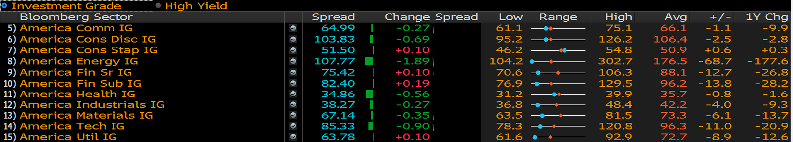
9 of the 10 are priced below (blue dot left of the orange diamond) their 1-year average.
And what about high yield (low quality):
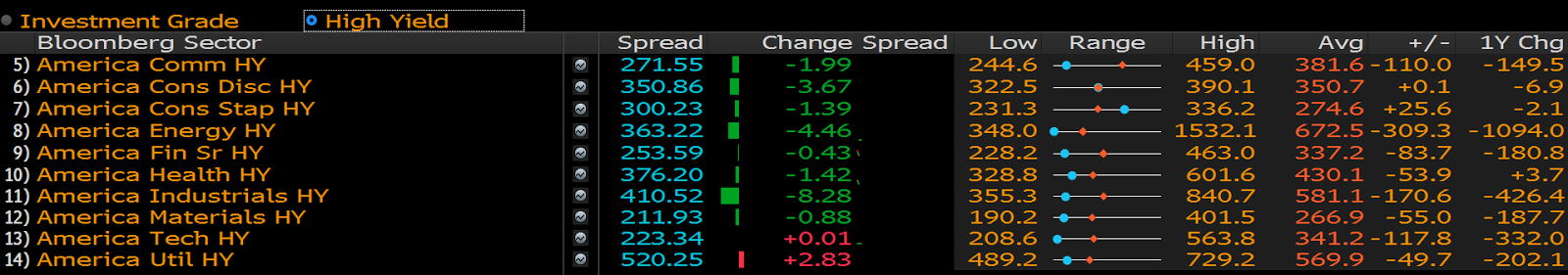
8 out of 10 cheaper, with 1 tie.
Well, U.S. CDS spreads certainly aren’t spelling panic by any stretch.
What about Europe? A lot of scary political stuff going on over there. Here are the spreads on investment grade debt:
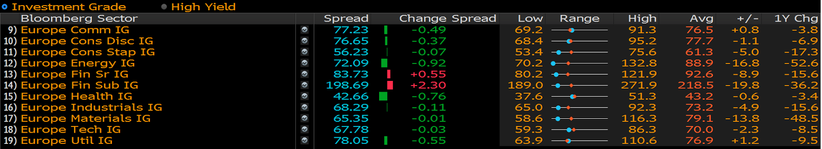
8 out of 10 cheaper than average.
And European high yield?
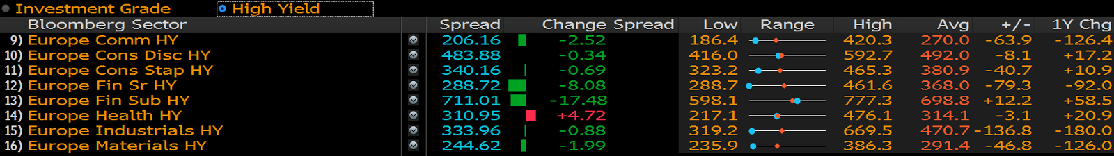
7 out of 8 cheaper.
Certainly no panic over there!
Asia?
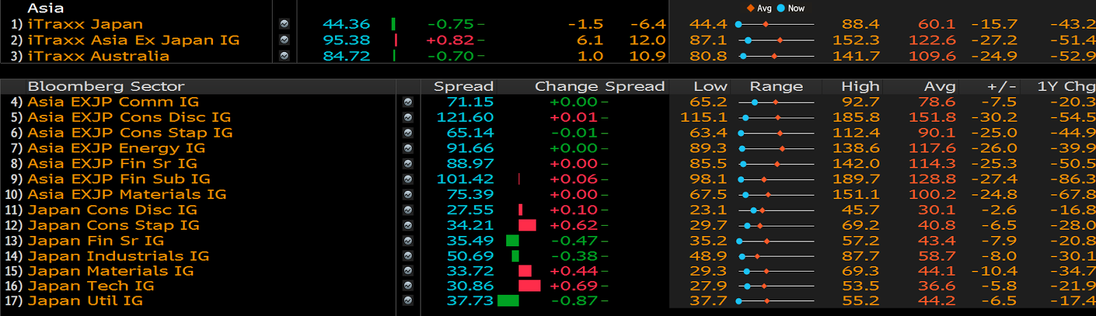
Wow! All cheaper…
I just can’t make the fear case (based on CDS spreads) for gold right here either.
Okay, so what about the price itself? How’s it trending?
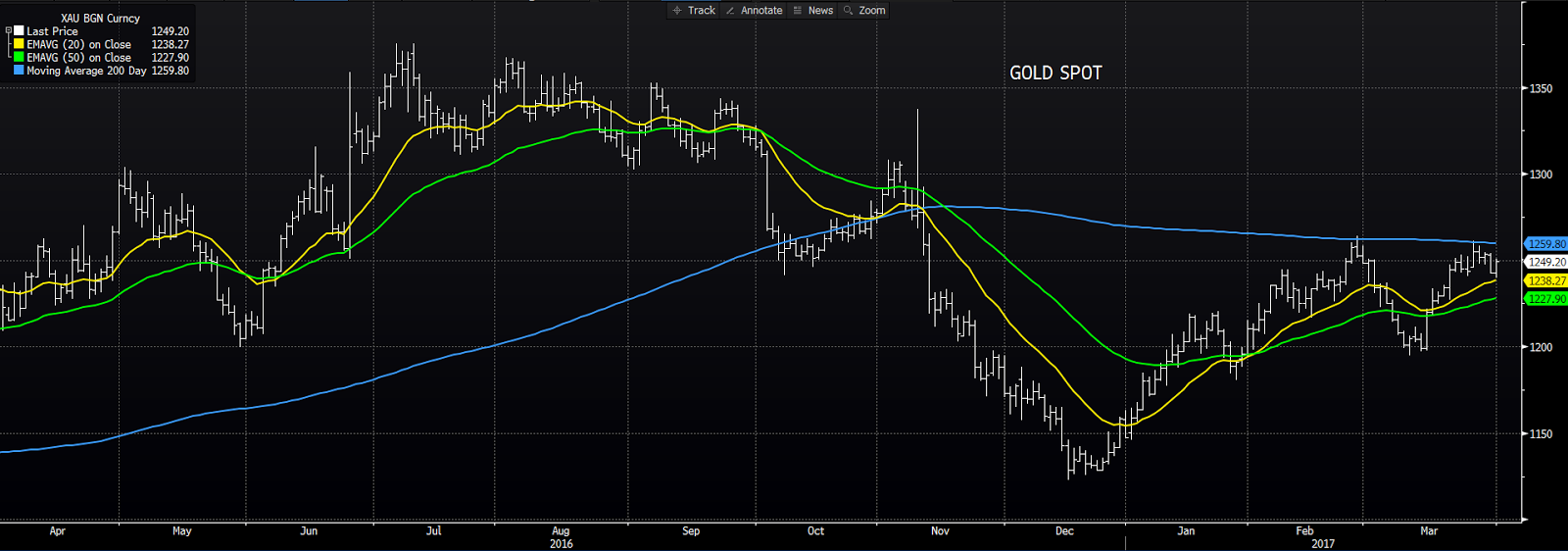
Well, the infamous 200-day moving average (blue) is very uninspiring, and is clearly where the bears seem to take over. The shorter-term averages (the 20 on top of the 50) paint a better near-term picture (although the price retreating at the 200-day would be the overriding technical signal [for me] at this point).
All told, while Ms. Pomboy inspired me to take a peak at my charts and a bit of data, the headline to her article doesn’t offer me remotely enough to, at the moment, get bullish on gold. And, no, I’m not reading the article. Gotta let the data speak for itself!
Have a great weekend!
Marty