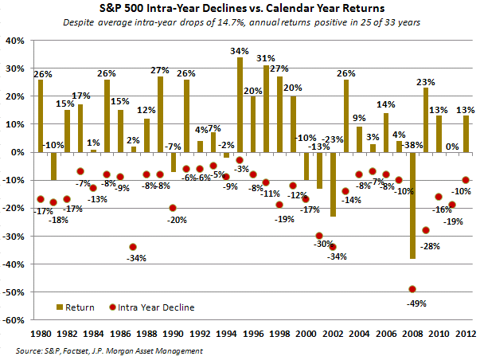

Take a look at the chart below. The bars represent the S&P 500’s gain/loss, and the red dots represent the index’s intra-year declines, for each year from 1980 through 2012. I believe 2013’s largest peak to trough decline was in the 4%-5% range. Notice how historically unusual 2013 was from a volatility standpoint. My point? Don’t get emotionally used to 2013-style volatility…